Intranet Enhancements for Hybrid Work
Project Summary
A large nonprofit foundation needed to update their intranet’s strategy and functionality after adapting a hybrid work model in 2022. My team implemented two significant updates: an updated navigation and a new employee dashboard.
Key Deliverables
Moderated prototype tests with employees
Design and launch of new site navigation
Content model of dashboard content
Design and launch of employee dashboard
My Role
Project lead and primary contributor
Timeline:
January 2023 - November 2023
Nondisclosure Agreement
Examples of this work have been lightly edited to protect the client’s data.
In 2022, our client announced a permanent transition to a hybrid work model. They realized their intranet was not optimized to meet the needs of hybrid workers. My team worked with their internal communications team to update the intranet’s strategy and brainstorm ways to bring these changes to life. We conducted an alignment session with key stakeholders from internal communications, IT, and people and culture to identify how the intranet’s role needed to change in response to a hybrid work model.
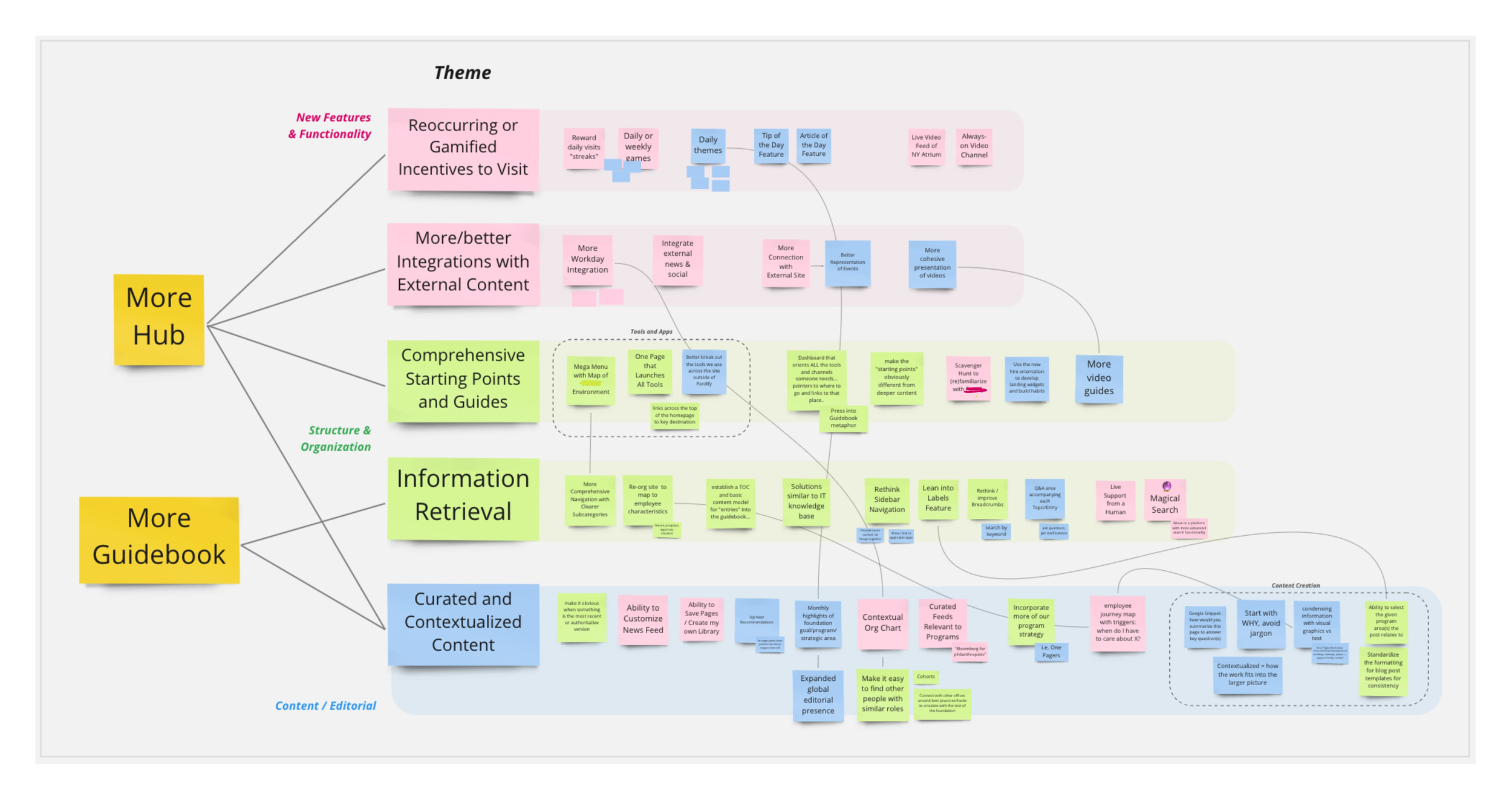
There were two primary strategic shifts we identified through our alignment exercise: making the intranet more of a central information hub and reinforcing the intranet’s role as a guidebook that contextualizes information.
Affinitizing ideas from our brainstorming session on how to bring the intranet’s updated strategy to life, mapping each category of ideas to one of the primary strategic goals for the intranet.
Two of the categories we identified during our brainstorming session emerged as the most impactful and feasible areas for improvement: improving information retrieval and providing curated content for specific audiences.
In terms of improving information retrieval, we quickly learned that technical limitations with the intranet’s platform prevented us from making substantive improvements to search. With that in mind, we decided it was an appropriate time to update the primary site navigation to support effective browsing.
In terms of providing curated content for specific audiences, we identified new employees as a subset of users who needed more assistance finding information. With this in mind, we began working on a dynamic onboarding dashboard that would appear on the intranet’s homepage for users in their first year at the foundation.
The intranet’s current navigation surfaced a lot of content, but employees often reported trouble finding the information they needed. Some menu headings had extensive menu options, while others had none. Additionally, several menu headings mixed content that was relevant to everyone and content that was only relevant to specific groups.
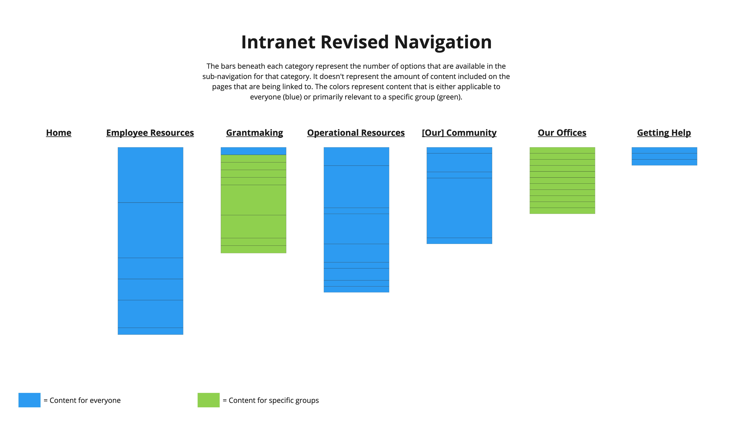
My team proposed an updated menu structure that would allow information to be distributed more evenly across headings while keeping information for narrow audiences in a separate area of the navigation.
Improving Information Retrieval
A model illustrating how content links are distributed in the existing site navigation. This shows the uneven distribution of content among categories, and shows how the Getting Things Done menu mixes together content for different audiences.
A model illustrating how content links would be distributed in the proposed navigation. This shows the more even distribution of content among categories, and cleaner separation of information for specific groups.
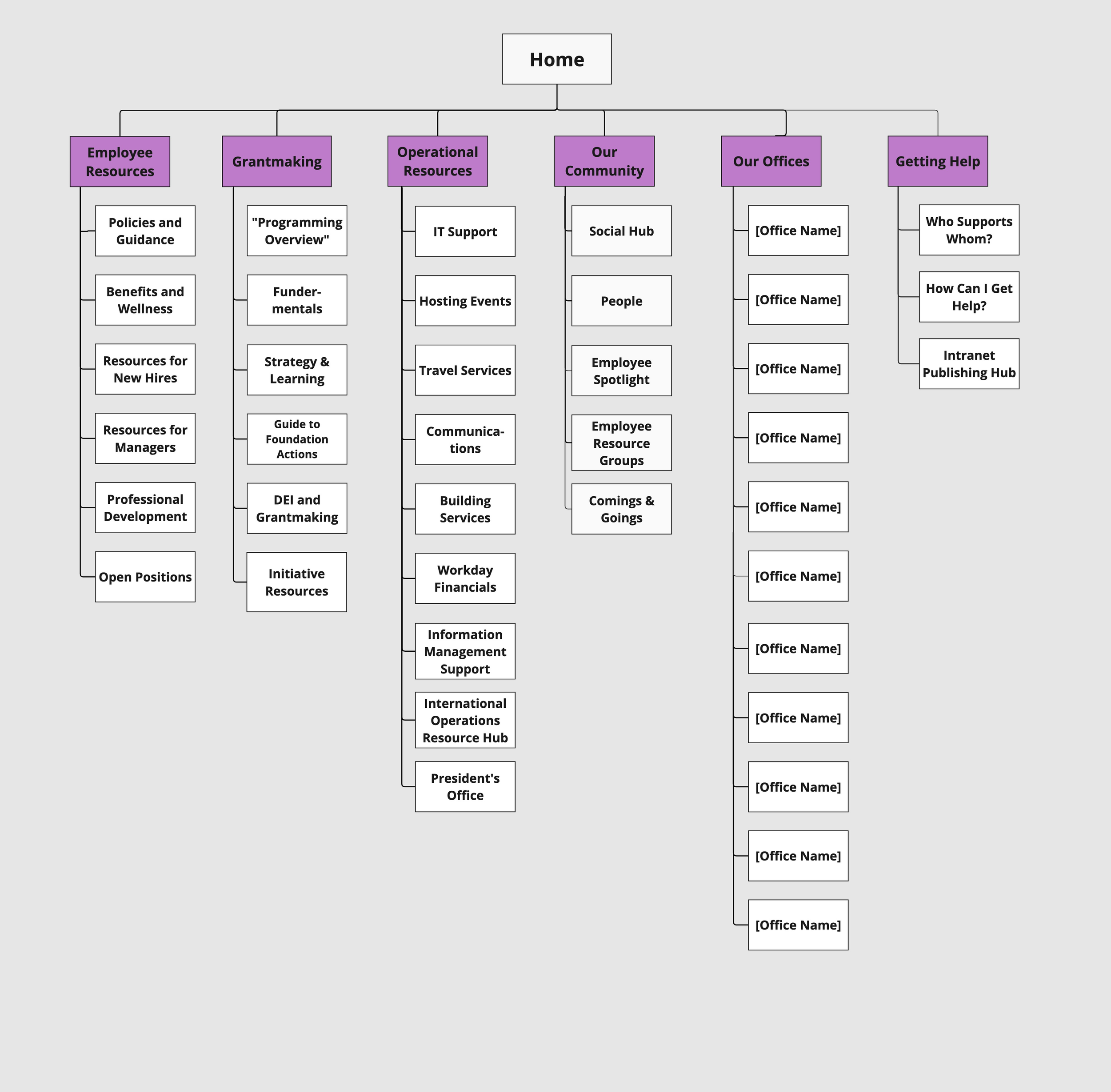
Once internal teams aligned on this updated approach to site navigation and which primary headings to use, we mapped out which links would be included in the menus. To do this, we made a visual hierarchy of the navigation in Miro. Many of the links we included were already featured in the navigation, and we simply moved them to a new parent heading. Other links to pages that have heavy traffic, or that people report difficult finding, were also included in the new navigation.
The hierarchy of menu headings and associated links for the updated site navigation.
After designing the new navigation, my team conducted two rounds of user research with employees: tree testing and moderated prototype tests.
We conducted two separate tree tests: a baseline test, seeing how well participants could find information in the existing navigation, and a proposed test, seeing how well participants could find information in the proposed navigation. Both tests were conducted using Optimal Workshop’s TreeJack tool. We used the same set of seven tasks for both tests. We were not able to recruit as many participants as we would have liked, with about 20 employees completing each version of the test.
At a high level, the tree test showed us that users struggled to find particular types of information, and that the two navigation schemes performed comparably well in tree testing. Due to the small sample size, we waited to make any recommendations until receiving additional qualitative feedback.
After tree testing, we conducted 15 moderated prototype tests with employees. We used a basic Figma prototype and conducted interviews over Zoom. Each interview lasted 45-60 minutes.
In interviews, we found that employees appreciated the new collection of menu headings. They had specific feedback to offer regarding labels and topics that were included in each menu. Overall, employees felt the new navigation made it easier to get to the information they were looking for.
“I think it’s definitely helpful to separate ‘Grantmaking’ and ‘Operations Resources.’ I guess splitting the two gets rid of that extra step of having to hover over [Getting Things Done]. I feel like this is a good balance to me, it’s not too crowded.”
— Employee
“Look, I like [the old heading label]. It’s conversational, more human. But I’m just very direct. I just want to know like, this is operations. So yeah, I like the categories that you’ve chosen, the newer ones. I like the way it’s grouped in a way that makes sense.”
— Employee
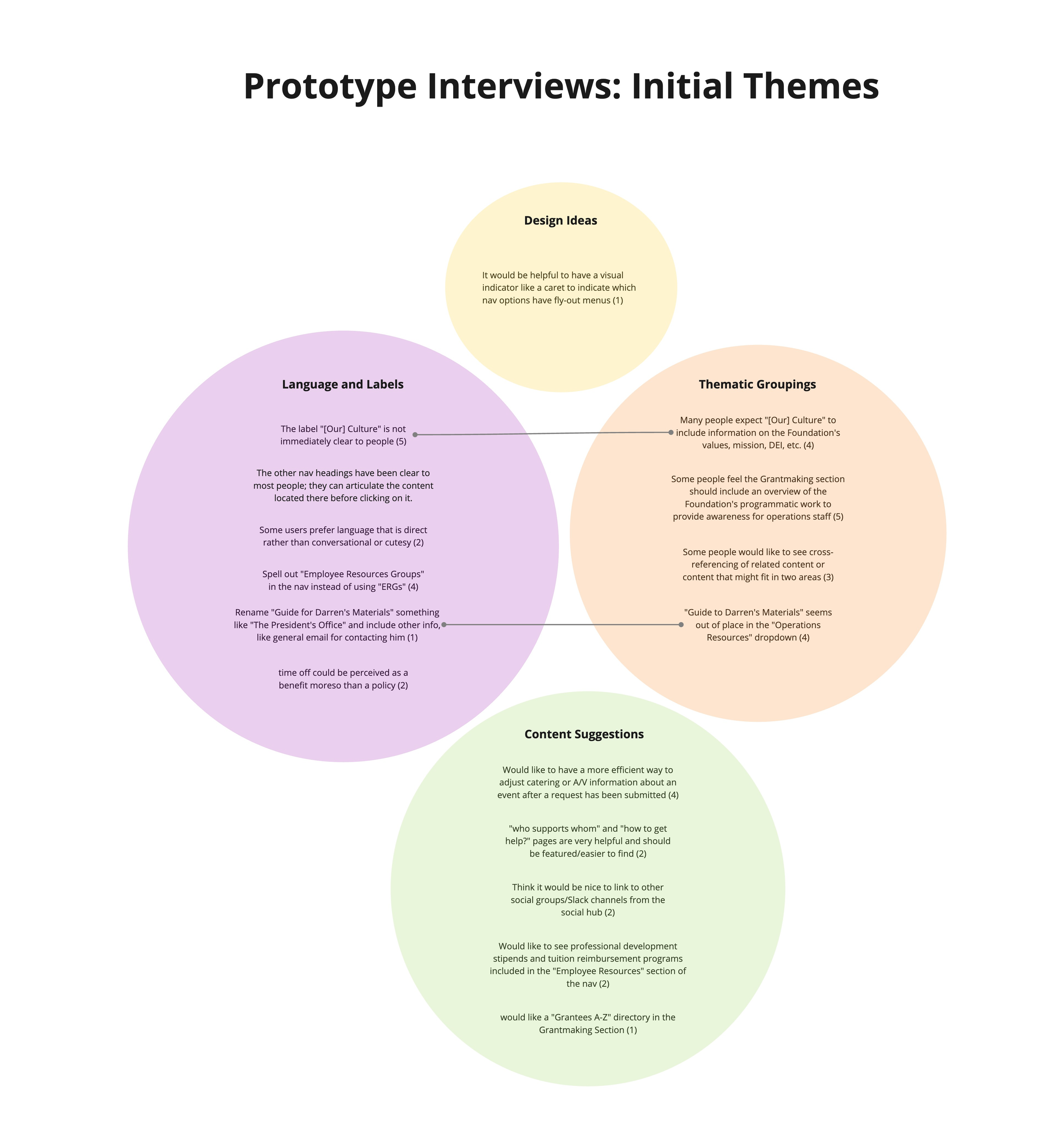
At the end of our interviews, we compiled a set of recommendations that reflected feedback we received from both tree testing and prototype tests. We grouped recommendations by theme and noted how many participants cited each recommendation in parentheses after each recommendation. Recommendations were reviewed for feasibility, and all recommendations that were possible to accommodate were incorporated into the updated navigation.
A model showing how research recommendations are thematically grouped. Lines show themes that are part of separate thematic groups, but semantically related.
After finalizing plans for the new navigation, my team launched the updated navigation in May 2023. The navigation has received positive feedback from employees, and employee requests for help locating content on the intranet have decreased according to annual employee surveys and anecdotal feedback.
Building a New Employee Onboarding Dashboard
There were several reasons we wanted to target new employees with an onboarding dashboard:
New employees require additional guidance and support as they acclimate to the organization.
Using the intranet to deliver onboarding content will develop a habit of looking for information on the intranet, emphasizing its role as a central information hub
The intranet is accessible from any location, making it equally effective whether employees are in the office or working from home.
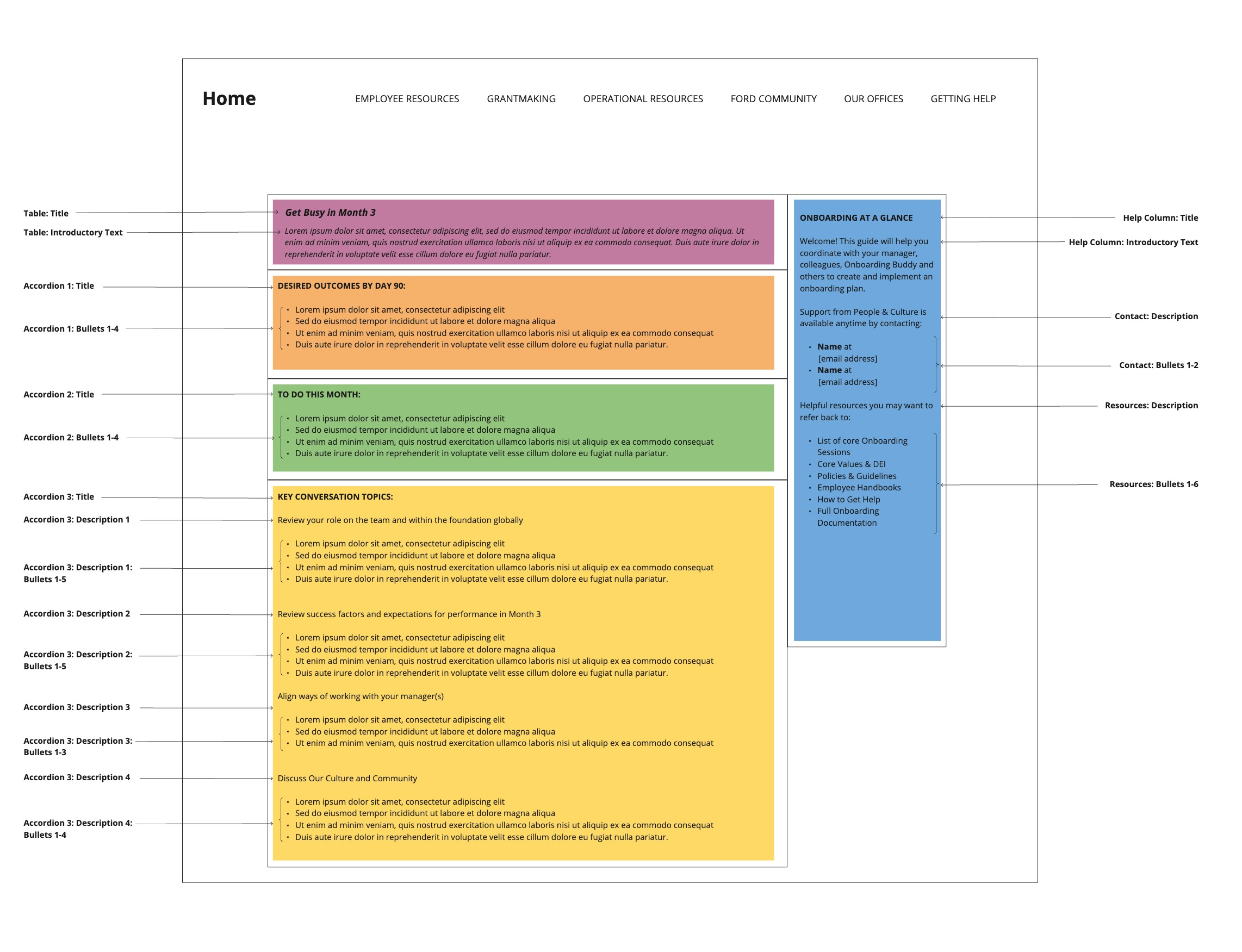
We began by taking the existing onboarding guide, a lengthy PDF, and mapping it onto a preliminary dashboard structure. We outlined five main sections of the dashboard:
A title section outlining the primary goals for this month in the onboarding process.
A section articulating desired outcomes by the end of that month.
A to-do list with key actions to complete
Key conversation topics to review with managers and colleagues
A panel highlighting key contacts and resources that should be referenced throughout the onboarding process.
A model showing the primary sections of the onboarding dashboard. Each section contains an example of the content that would be featured in each section, using month 3 of the onboarding process.
After outlining the dashboard structure and aligning on which information to include, my team created a comprehensive content model. The content model articulated the time intervals used for the onboarding process and contained the actual copy for each section of the dashboard for the corresponding time interval.
Then, we collaborated with other departments to determine the technical processes that would be required to serve up dashboard content to the appropriate audiences. This included tasks such as setting up an integration between Workday and the intranet platform to display the appropriate dashboard content based on a user’s hire date.
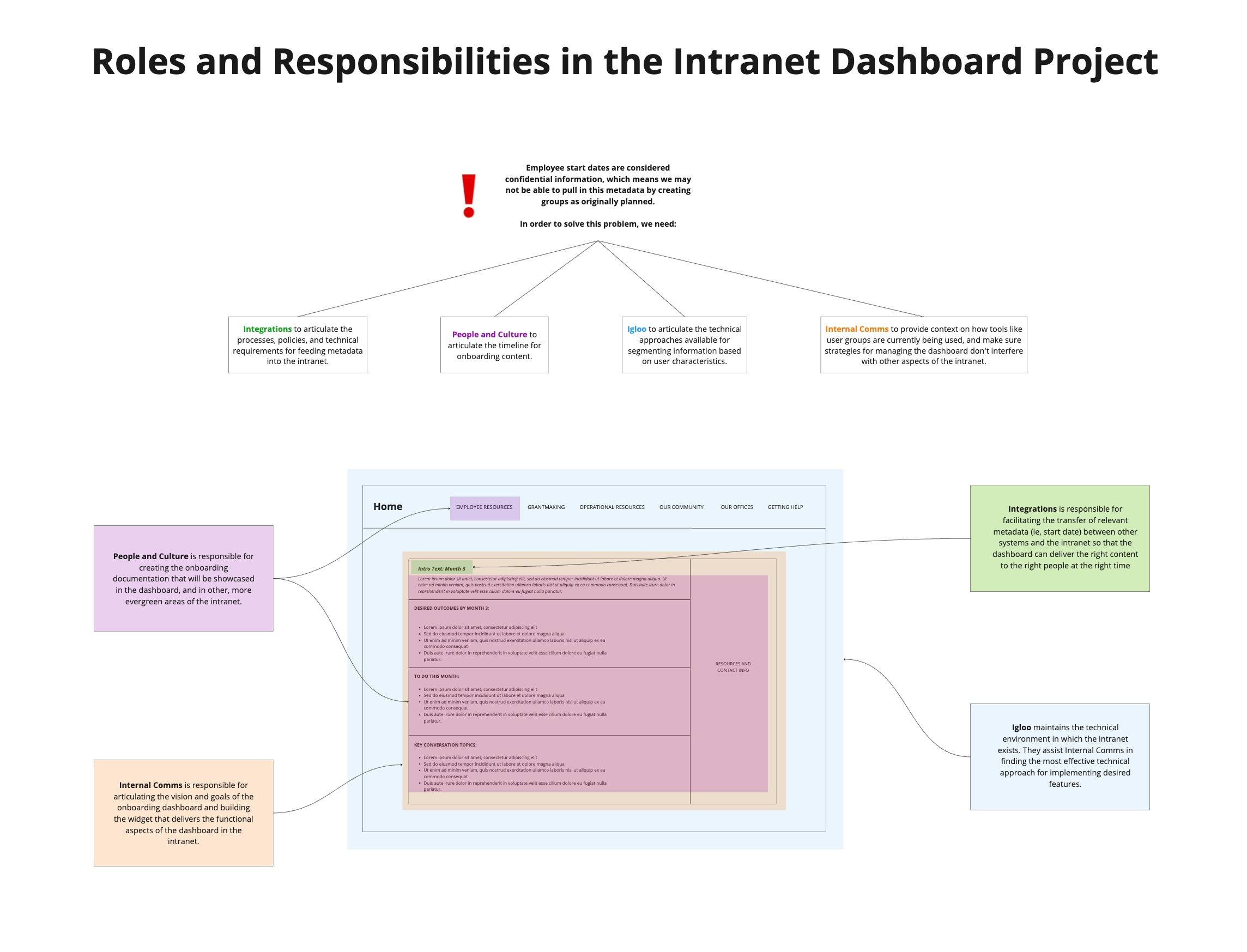
We mapped the roles and responsibilities of each team involved onto the corresponding content area within the dashboard.
The block in the middle of this model shows the general structure of the dashboard in the context of the intranet’s homepage. The colored blocks indicate which portion of content each team is responsible for.
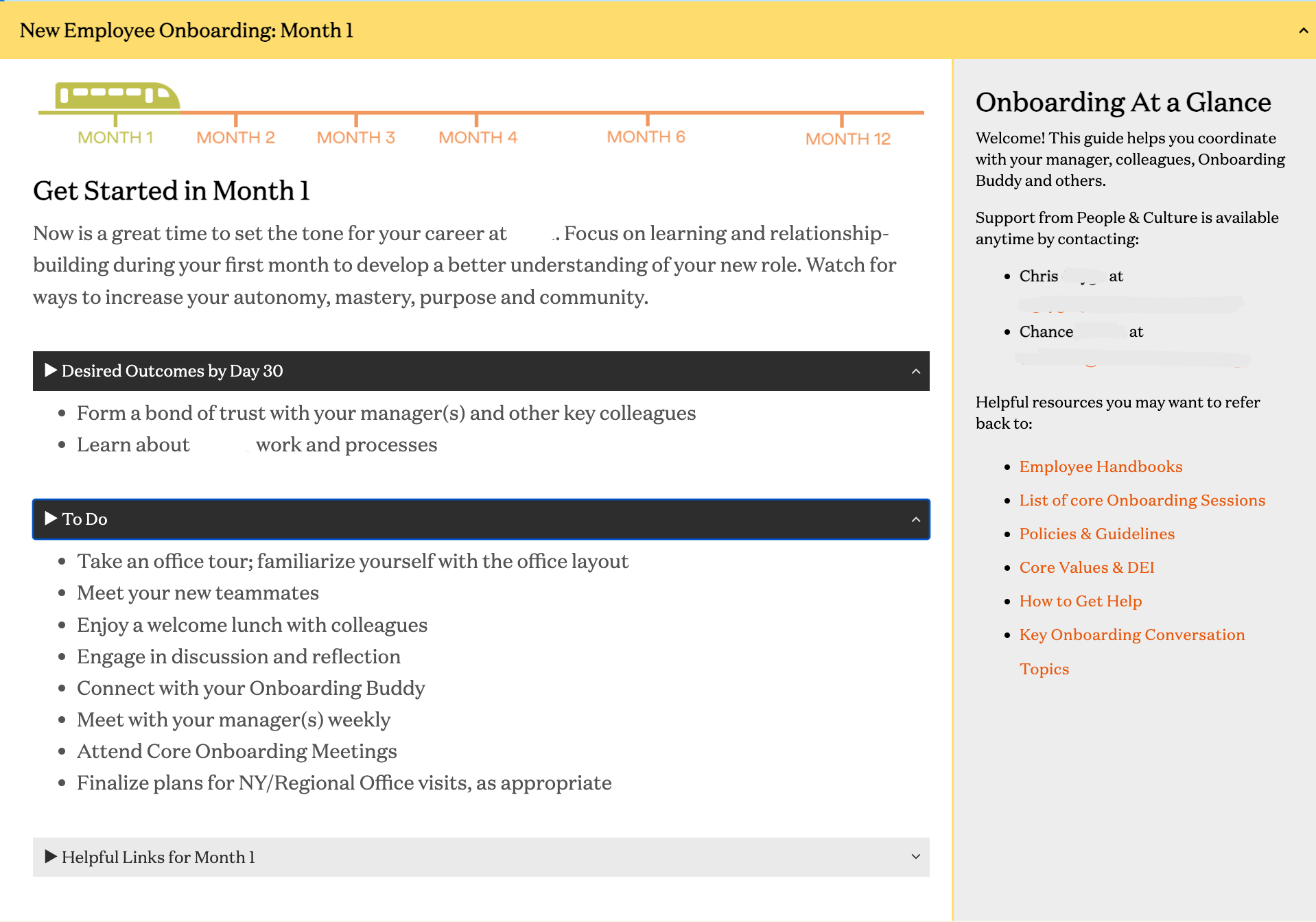
The live dashboard was launched in late 2023 and featured unique dashboards for months 1, 2, 3, 4, 6, and 12 of the onboarding process.
A screenshot of the live onboarding dashboard featuring content for month one. Personal information has been redacted.
Project Impacts
Improvements made to the intranet from 2022- 2023 have improved its performance:
The share of employees using the intranet daily has increased significantly
Employees are able to use self-serve tools to locate information and resources more effectively
Engagement with intranet content has increased
The new employee dashboard received a workplace transformation award from Igloo, the intranet platform, in 2023
